[Problem]
A deeply personal premise — an open invitation to apply to be my next travel partner — needed a site that felt like a postcard, not a product. Most personal sites either over-explain or default to a social-feed shape that flattens the tone.
[Approach]
- 01Built around a single photo-led hero and a short manifesto on the vibe — hot springs, tide pools, mountain hikes, snowy moon walks, slow café mornings.
- 02Designed a quiet gallery of recent wanderings as the proof, in place of a feature list.
- 03Kept the application form short and the site free of social feed, booking funnel, or anything that would change the register.
[Outcome]
A personal, editorial site that reads like an invitation rather than a profile — and a working application pipeline for the people it's meant for.
[Background]
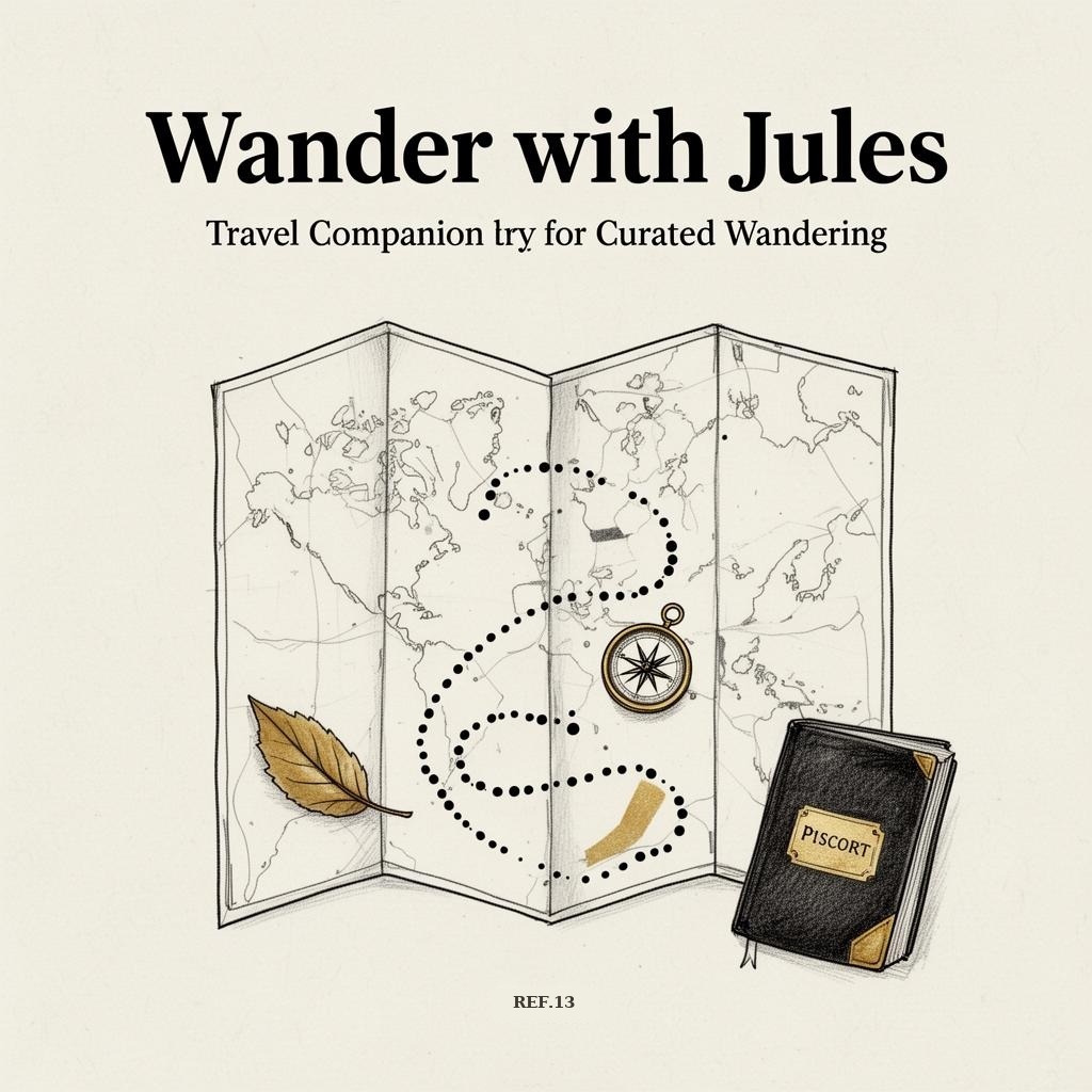
Wander with Jules is a personal, editorial site built around a single premise: an open invitation to apply to be my next travel partner. Hot springs, tide pools, mountain hikes, snowy moon walks, camping nights, slow café mornings — and the small magic in between.
The site is deliberately quiet — a photo-led hero, a short manifesto on the vibe, a gallery of recent wanderings, and an application form. No social feed, no booking funnel. The work was less about scaling features and more about finding the right tone for a site that needs to feel like a postcard, not a product.